
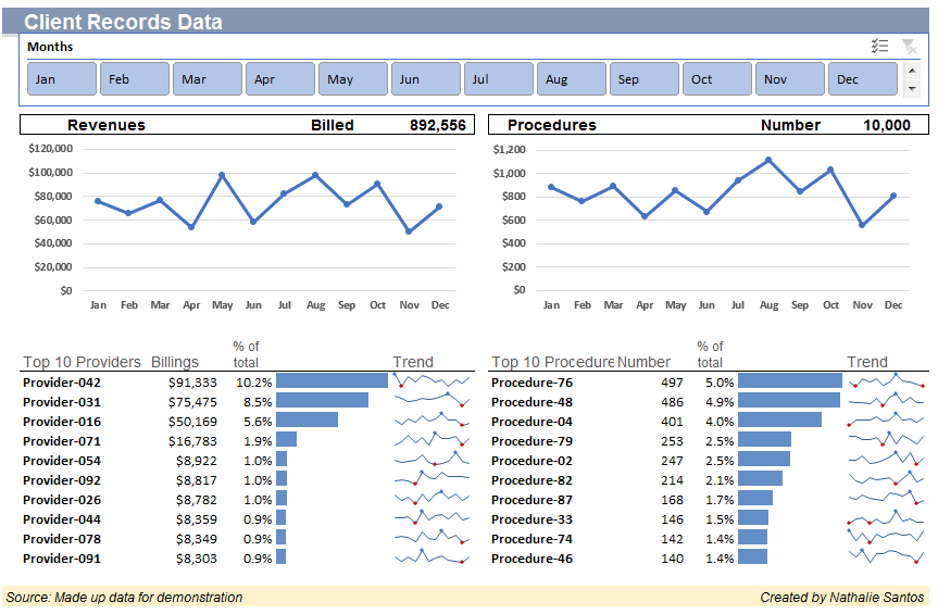
The Holiday and rollout of a new Procurement Policy greatly reduced my workload this week. So, I decided to create my first dashboard! It has all the essentials: pivot tables, pivot charts, if functions, iferror functions (because you can’t be too careful), conditional formatting, sparklines, and a slicer. The materials came from UNC guest lecturer and Excel Guru, Dale Roegnik. I highly recommend any incoming students to take the class if Professor Roegnik offers it in August.
-click the image to use-
Beyond using Excel functions, the dashboard relates little to my work in the Finance Department. Even more removed is this Tableau Map, which shows select demographics and housing information of Orange County, North Carolina.